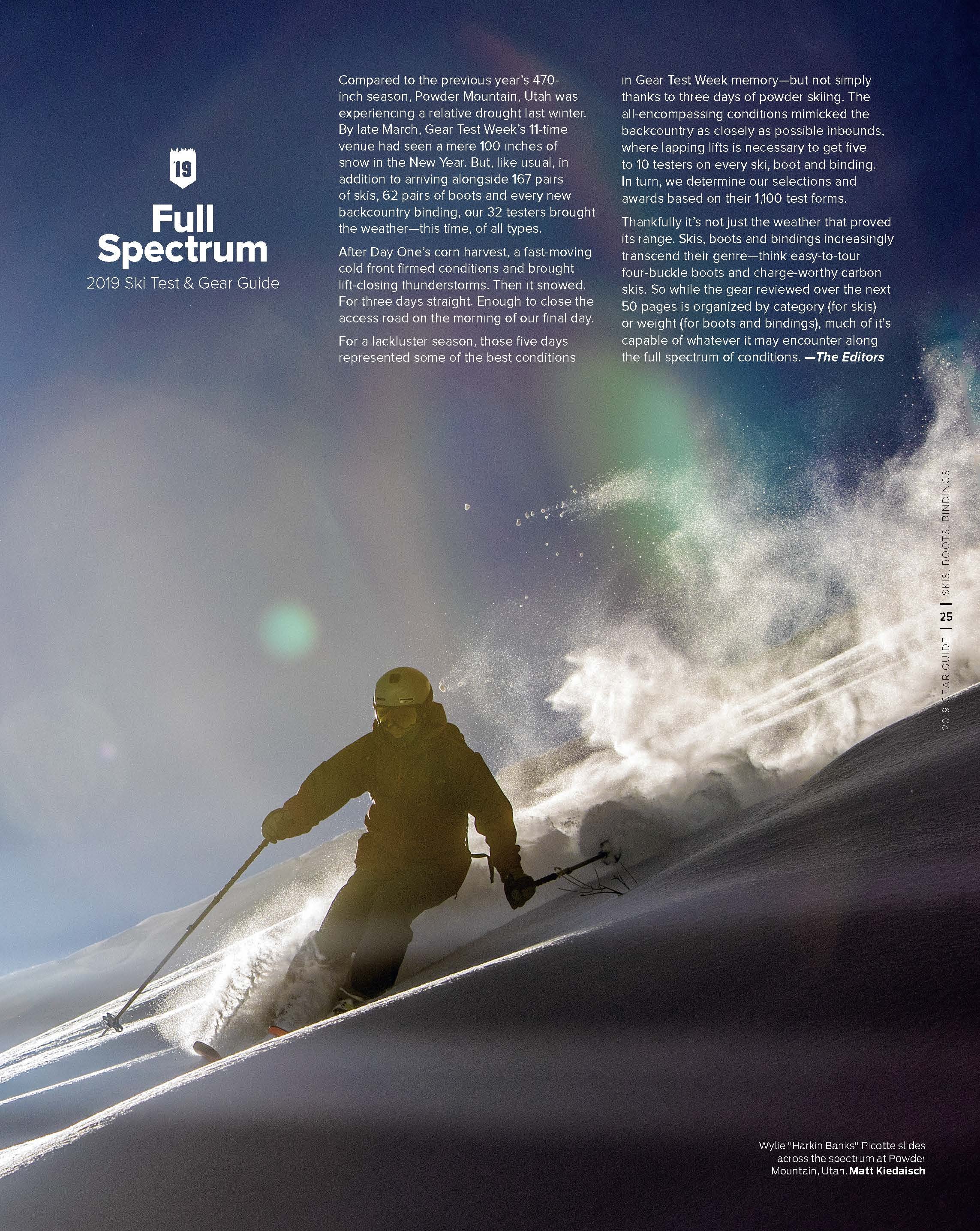
Gear Guides
Chasing down the current trends in portrayals of gear reviews is a balance between leading readers through information and making that information accessible when the reader probably isn’t interested in reading what isn’t relevant to their buying habits.

The 2023 Gear Guide - Futuristic, yet refined. We didn't want to beat people over the head with the futuristic idea, so subtly cutting out pieces of the main sell line bridged the gap between modern and gaudy.
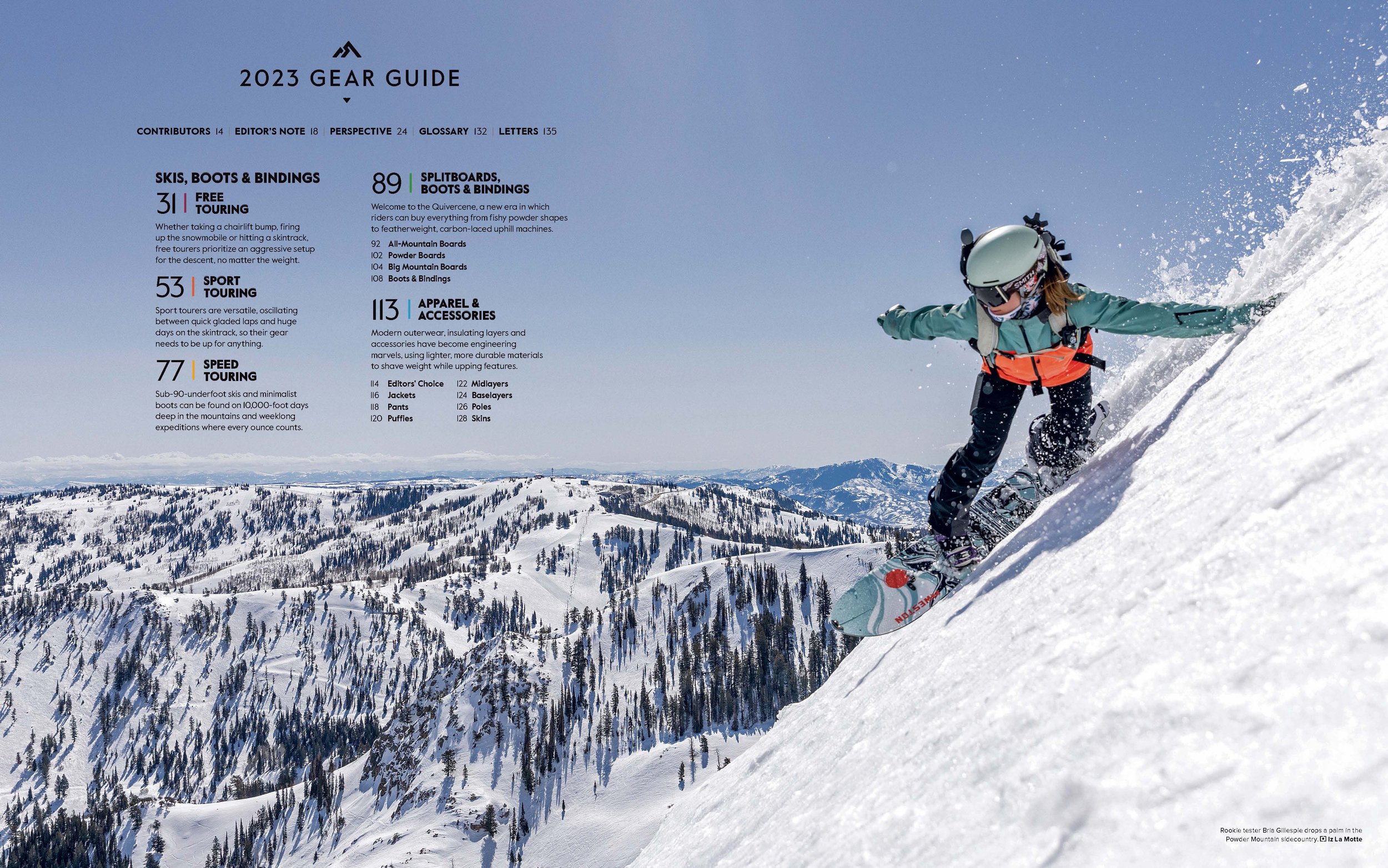
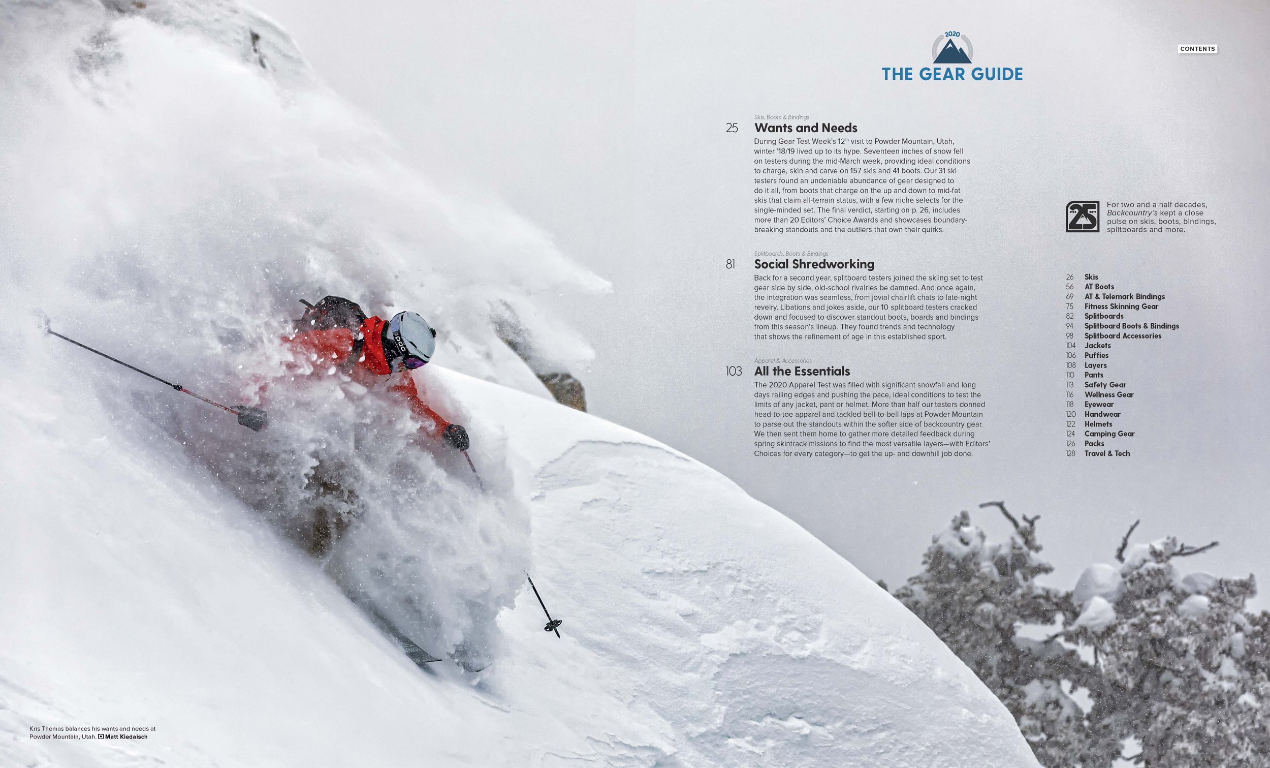
The Department Contents - I wanted to introduce the color scheme for each gear section without the colors overwhelming the photo or the typography. This new method of sorting gear types required a lot of balancing word counts and choosing colors that wouldn't come off as an overt rainbow. The end result was warm colors for ski sections and cool colors for splitboards and apparel.

Perspective - Bringing readers into the process of how a gear test is conducted requires a degree of pulling the curtain back, so I chose the overhead view of tester sheets to show how the raw data comes in. The rest of the spread requires careful hierarchy of typography to lead readers' eyes through the content in the order I want them to read it.

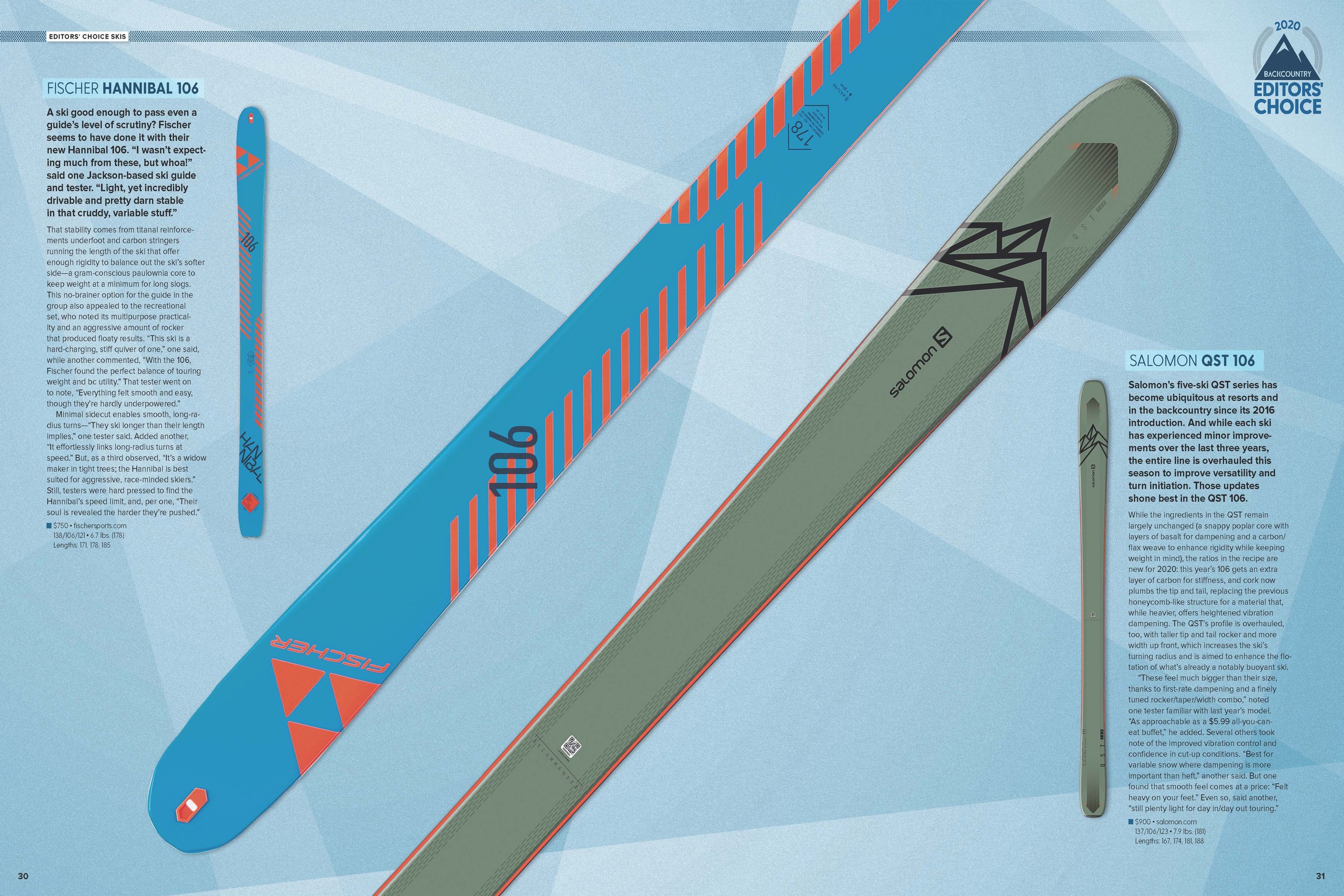
An editors' choice spread - This one features my personal favorite skis of the 2023 Gear Test and my first direct quote from my review. The idea behind the design elements in the background was that we would shoot the skis on colored plexiglass to add visual interest with the reflections of the topsheets, but it wasn't coming out quite the way we wanted it, and it ended up being more clear for readers what was going on with the reflections by faking them. This also allowed for more consistent photography through the Gear Guide and saved our photographer a lot of time.

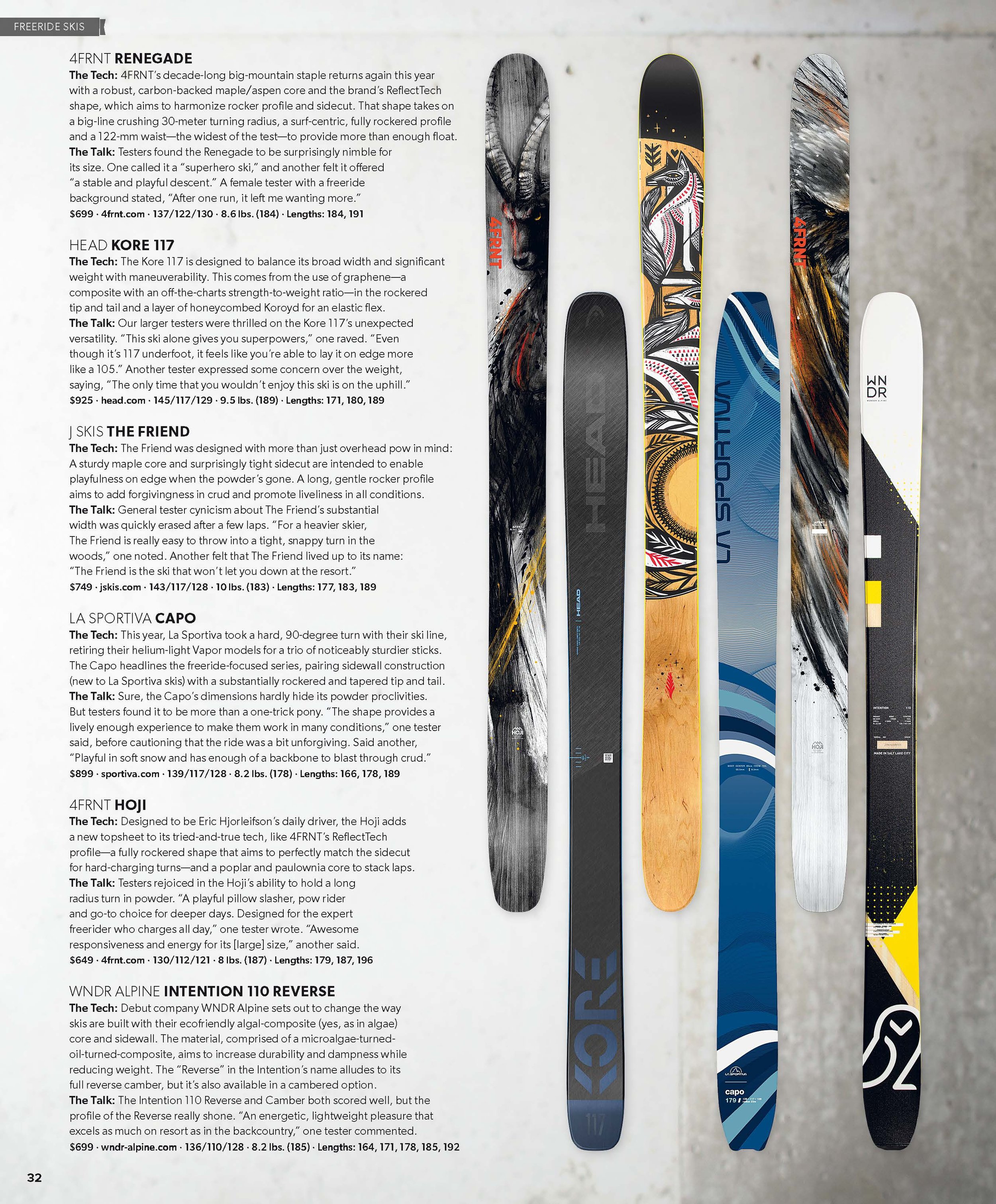
Editors' Select Skis - Switching up the layout on Select pages each year takes careful consideration to keep the look fresh and the information clear, legible and visually interesting. For the sidebars, I drew the design elements in Illustrator for consistency between sections.

Editors' Select Boots - Another sidebar where I drew the design elements in Illustrator. It was fun to figure out a balance between "generic touring boot" and "clearly a touring boot".

Editors' Select Splitboards - Yet another example of using typography to lead readers' eyes around the page in a specific order.

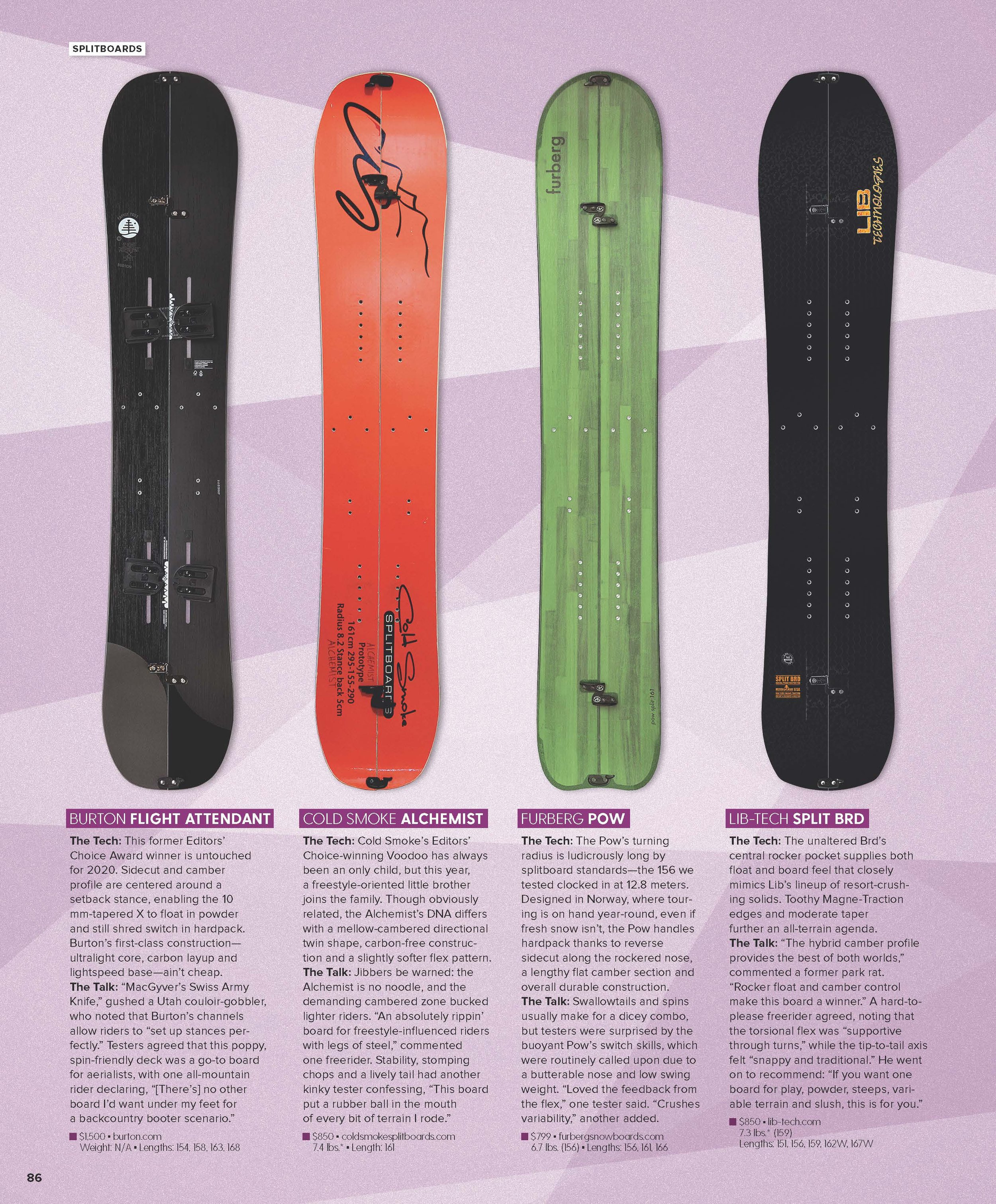
Editors' Choice Splitboard Boots & Bindings - Boots and bindings don't always tesselate in a way that allows an equal amount of space to be allocated to each product, so I have to come up with creative ways to make each product seem as if it's getting equal attention while keeping the scale of each product consistent.

The 2022 Gear Guide - The amount of tweaks in the words "Wild Rides" was insane. Every letter was redrawn by hand to keep the style consistent with the font but legible as a whole. Tails were abridged. Tittles were shortened. Bowls were increased. Feet were angled. Letters were flipped. Transparencies were adjusted. Just the words Wild and Rides are three different stacked layers to get the right color adjustment based on the snow and shadows in the background.
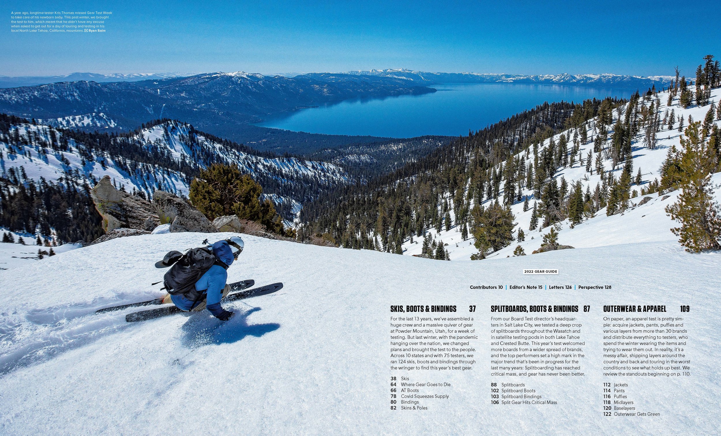
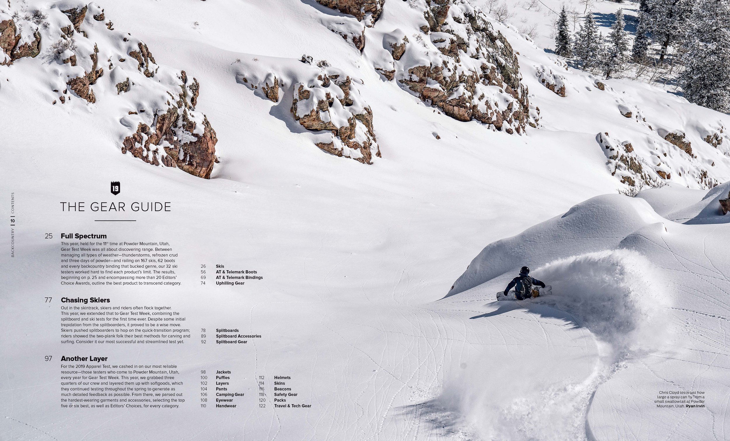
The Contents Spread - From year to year, the structure of the contents pages changes, and it's up to me to match the theme of the issue with the typography, and the first real place that the style is introduced is the contents. It has to look good to prime the reader for the rest of the gear guide.

A Special Year - Since this gear test was conducted during COVID, the entire structure of the Gear Guide had to change to represent every place that products were tested. I designed this map from the ground up to look like a vinyl sticker. This is also the first place where the hierarchy of typography is reinforced for the rest of the issue.


Section Openers - Sometimes, a photo just works perfectly.

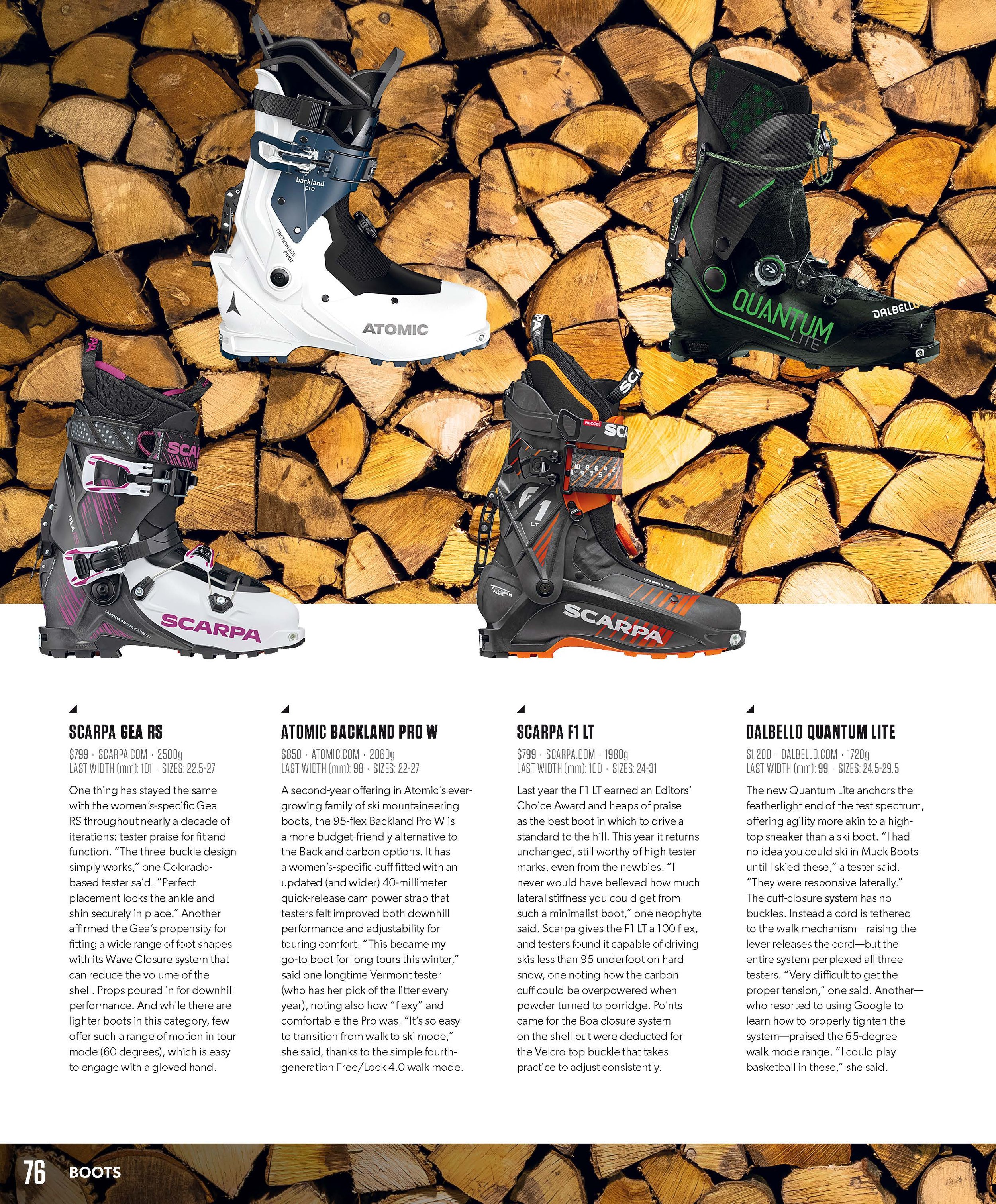



Hey, that's me!


